Introduction
Short, purposeful text—microcopy and CTAs—has an outsized effect on contact rates for B2B professional services. This guide explains why concise wording matters for a microcopy cta b2b website uk, and gives practical wording examples, placement advice, simple tests and a two-week checklist you can apply to increase enquiries across the UK.
Why microcopy and CTAs matter for B2B websites
The difference between macro copy and microcopy
Macro copy tells your story: services, approach and proof. Microcopy sits in the small moments that guide action—button text, form hints, confirmation messages and single-line trust notes. Those moments reduce friction and stop potential clients abandoning a contact attempt.
How short CTAs reduce friction for decision-makers
B2B purchasers are time-poor and risk-aware. A brief, concrete CTA clarifies the next step and reduces hesitation. Compare “Contact us to discuss options” with “Book a 15‑minute call”—the latter sets a clear, quick commitment and feels easier to accept.
Common B2B obstacles microcopy can address (trust, timeliness, complexity)
- Trust: small signals such as “No obligation” or “Client examples available” help.
- Timeliness: note if response typically arrives within 24–48 hours.
- Complexity: add brief scope hints like “For UK SMEs and professional firms” so visitors know the service fits them.
Core principles for effective microcopy and CTAs
Be specific and outcome-focused
Say what happens next. Replace vague CTAs with outcome-driven wording: “Get a project estimate” rather than “Enquire”. Specific CTAs attract more qualified responses.
Use plain British English and a professional tone
Match the tone of your audience: professional services often require slightly formal phrasing, but avoid jargon. Use British spelling and familiar business terms.
Keep it short: recommended character limits
Button CTAs: aim for 2–5 words (20–35 characters). Secondary actions can be 3–7 words. Form hints and inline microcopy should be one short sentence or fragment (under 100 characters).
Signal next steps and set expectations (time, scope, costs)
Include a short expectation line near CTAs: for example, “We’ll reply within 48 hours” or “Free 15‑minute initial call”. This reduces friction and screens out low-interest enquiries.
Use social proof and trust signals sparingly and verifiably
Include one-line proof where useful: “Trusted by UK professional firms” or a short client-count claim only if it’s accurate. Keep proof close to the CTA to reassure without overwhelming the action.
Practical CTA wording examples for UK B2B websites
Top-of-funnel CTAs (download, learn, explore)
- “Download our fee guide”
- “Read the case study”
- “Explore services”
Top-of-funnel CTAs should promise value with minimal commitment.
Mid-funnel CTAs (book a call, request a quote, see case studies)
- “Book a 15‑minute call”
- “Request a written quote”
- “See sector case studies”
- For ecommerce B2B sellers: Discuss your ecommerce store project for platform-appropriate CTAs.
Bottom-of-funnel CTAs (request a proposal, start project)
- “Request a proposal”
- “Start your project”
- “Agree scope and timescale”
Microcopy for buttons vs microcopy for form hints
Button text is the commitment trigger—keep it short and action-focused. Form hints reduce confusion: for example, under a budget field write “Typical projects: £5k–£25k” only if accurate. For phone numbers, use “Best contact number (work/mobile)” to guide input.
Microcopy specifically for professional services
Contact button examples for advisory and professional firms
- “Arrange a brief consultation”
- “Request a fixed-fee quote”
- “Talk to a senior adviser”
These phrases balance formality with clarity. Add a one-line trust note such as “No obligation initial review” where appropriate.
Form field microcopy and privacy hints (GDPR-aware)
Use short, transparent privacy microcopy next to email collection or consent checkboxes. Example: “We’ll only use this to reply—see our privacy notice.” Include a clear consent checkbox when collecting marketing preferences, and avoid pre-ticked boxes.
Appointment and booking microcopy (time expectations and cancellations)
When offering bookings, state duration and cancellation policy succinctly: “30‑minute video call — cancel up to 24 hours before.” Clear boundaries reduce no-shows and set professional expectations.
Where to place CTAs and microcopy on a B2B website
Hero area CTAs: primary vs secondary actions
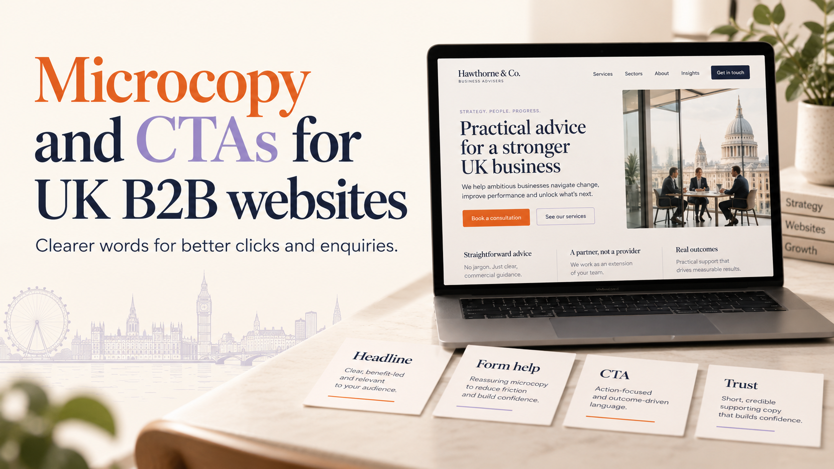
Offer one primary action and one secondary. Primary should be the fastest route to contact (e.g. “Book a 15‑minute call”). Secondary can be lower-commitment (e.g. “View services”). Keep a short explanatory line under the buttons to set expectations.
Service pages: inline CTAs and microcopy for trust
Place inline CTAs after key benefits and before pricing or process sections. Use small microcopy beside them: “Typical timeframe: 4–6 weeks” or a link to proof. For deeper guidance on structuring service pages and CTAs for professional firms, see our article on High-converting B2B service pages for UK professional firms.
Contact pages and sticky CTAs
Keep the contact page simple: short intro, clear options (call, email, book) and a brief privacy line. Consider a sticky CTA on longer pages for quick access to the contact form or booking link.
Mobile considerations and responsive placement
On mobile, prioritise one prominent CTA and hide secondary actions behind a menu or expandable area. Use large, tappable buttons and keep microcopy concise. If you need help ensuring CTAs display correctly across devices, request a responsive review via Request a responsive website review.
Testing, measuring and improving contact rates
A/B testing basics for CTAs and microcopy
Test one element at a time: button text, microcopy line, or placement. For low-traffic B2B sites, run longer tests and focus on high-impact pages (service pages, contact page). Use clear success criteria before you start.
Key metrics: click-through rate, contact form completions, qualified lead rate
- Click-through rate on CTA buttons
- Contact form completion rate
- Qualified lead rate (the proportion of enquiries that match your target client profile)
Qualitative feedback: on-page surveys and user interviews
Add brief slide‑in surveys or ask new contacts one quick question about why they reached out. Short user interviews with clients can reveal wording that resonates in your sector.
Iterative process and running reliable tests
Run a cycle: hypothesise, implement, measure, learn, repeat. Keep tests long enough to collect meaningful data and pause other major site changes while a test runs.
Accessibility, legal and UX considerations
Accessible wording and clear focus states
Use clear, descriptive CTA text for screen reader users (avoid “Click here”). Ensure focus states on interactive elements are visible and that button labels describe the action.
GDPR-friendly form microcopy and consent checkboxes
State why you collect contact details and how you will use them. Offer a simple opt-in for marketing and avoid pre-ticked boxes. For legal or regulatory questions about consent, seek appropriate guidance.
Avoid misleading or exaggerated claims
Keep promises factual and verifiable. Misleading microcopy harms trust and can create complaints in professional services contexts.
Implementation checklist and quick templates
Two-week implementation checklist
- Audit existing CTAs and microcopy on top pages (home, 3–5 service pages, contact).
- Replace vague CTAs with specific, outcome-focused wording.
- Add a one-line expectation near each contact CTA (response time, call length).
- Update form hints and privacy microcopy to be GDPR-aware and concise.
- Run a single A/B test on your highest-traffic service page CTA for 2–4 weeks.
- Collect qualitative feedback from new enquiries for one month and adjust copy.
10 short CTA templates for B2B service pages (copy you can use)
- “Book a 15‑minute call”
- “Request a proposal”
- “Get a project estimate”
- “See sector case studies”
- “Request a fixed-fee quote”
- “Arrange a brief consultation”
- “Start your project”
- “Download the fee guide”
- “Talk to a senior adviser”
- “Request implementation timeline”
Form-field microcopy templates and example placements
- Email field: “Work email for replies (we won’t share it)”
- Budget field: “Typical projects: £5k–£25k” (only if accurate)
- Phone field: “Best contact number — daytime preferred”
- Consent line: “I agree to be contacted about this enquiry” (with a non‑preselected checkbox)
Localising microcopy for UK audiences
Language choices and British English phrasing
Prefer terms like “quote” rather than “estimate” if your sector uses that wording. Use British spelling and familiar British business terms to build rapport.
Regional cues without creating separate pages
Signal UK-wide availability with a simple line such as “Consultations across the UK”. For stronger local relevance, mention city names only on appropriate pages; keep service pages broadly UK-focused to avoid duplicate content.
When to mention locations (e.g. consultations across UK-wide)
Include location references where they matter: an events page, regionally focused case studies or the contact page listing office locations. If brand tone needs refinement, you can align microcopy voice with a stronger identity—consider a Request a custom logo consultation to ensure tone and logo match.
Next steps and resources
Start with the two-week checklist and test one CTA change at a time. If you prefer expert help to implement and test CTAs on a WordPress site, you can Request a WordPress website consultation or Request a B2B website consultation to discuss priorities and practical fixes.
FAQ
What is microcopy and how is it different from regular website copy?
Microcopy is the small text that guides interactions—buttons, form hints, labels and confirmation messages. Regular (macro) copy explains services, benefits and proof. Both matter, but microcopy directly reduces friction at conversion points.
How short should CTAs be on B2B websites aimed at UK audiences?
Aim for 2–5 words for primary buttons and up to 7 words for supporting actions. Keep any extra context in a one-line microcopy under or beside the button.
Which microcopy changes have the biggest impact on contact rates?
Clear action wording (e.g. “Book a 15‑minute call”), short expectation lines (response time or call length), and GDPR-compliant privacy hints often yield noticeable improvements.
How do I test different CTAs without harming my conversion data?
Test one variable at a time, run the test for a sufficient period (several weeks on low-traffic sites) and avoid other major site changes during the test window.
Do I need different CTAs for mobile and desktop visitors?
Keep the intent the same but simplify mobile CTAs: one primary, large tappable button and concise microcopy. Where space allows on desktop, offer the secondary action as a link or smaller button.
Request a free consultation with Logo Metic — if you’d like practical help implementing these changes, email us at support@logometic.co.uk or call +44 7883 180004 to discuss your project.