
Introduction
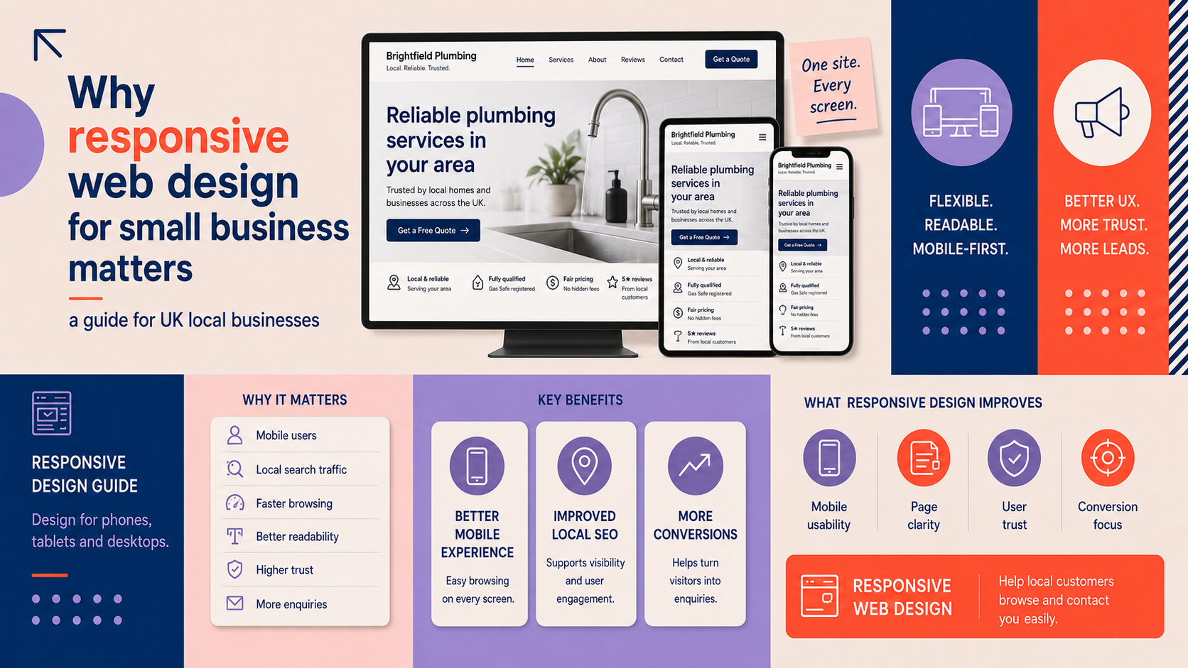
Responsive web design for small business means creating websites that adapt to screens of any size so local customers can find, read and act on your site whether they are on a phone, tablet or desktop. This short guide explains what responsive design is, why UK local businesses should care, and gives practical tests, a checklist and sensible next steps you can take this month.
What is responsive web design and why it matters
Definition: responsive, adaptive and mobile-friendly explained
Responsive design uses flexible layouts, images and CSS media queries so content reflows to fit the user’s screen. Adaptive design serves different fixed layouts depending on device size. A separate mobile site is an entirely different URL and codebase. For most small businesses, responsive design offers the best balance of maintenance and consistent user experience.
Consistent branding on every device helps customers recognise your business. If you need brand work alongside a site refresh, our custom logo design service can help ensure your identity works on small screens.
Why local customers expect mobile-friendly business websites
Many local interactions begin on a mobile device — searching for opening times, calling a business, checking directions or booking an appointment. A mobile friendly business website that places click-to-call buttons, maps and clear contact details near the top makes it easier for customers to convert.
How responsive design affects user experience, conversions and SEO
Sites that display correctly on small screens reduce frustration and increase the chance a visitor will complete a desired action, such as booking or calling. Search engines also consider mobile usability when ranking pages, particularly for queries with local intent. A responsive site that loads quickly and is easy to navigate helps both users and search visibility.
If your site has deep issues and a rebuild is needed, read our guide on the signs your website needs a redesign to decide whether to repair or rebuild.
How to tell if your website is mobile friendly
Quick manual checks: navigation, tap targets, legibility and forms
- Open your site on a phone and try the main tasks a customer would do: call, find directions, book or buy. If these are hard to find, the site is not optimised.
- Check navigation: menus should be reachable and not cover content; avoid tiny links that are hard to tap.
- Tap targets (buttons and links) should be large enough and spaced apart to prevent mis-taps.
- Readability: text should be legible without zooming; line length and font size should adjust for small screens.
- Forms: test input fields, label behaviour and whether the keyboard type matches the field (numeric keyboard for telephone fields, for example).
Free online tools to run
Run automated checks with tools such as Google Mobile-Friendly Test, PageSpeed Insights and Lighthouse. These highlight layout problems, resource blocking and performance issues. Use cross-browser services like BrowserStack for device previews if you don’t have many physical devices to hand.
How to interpret common results and prioritise fixes
Automated reports typically flag issues in three areas: layout problems, slow resources and accessibility. Prioritise fixes that directly affect conversions: broken navigation, unreadable text, and forms that fail on mobile. Then tackle performance and accessibility improvements.
Practical steps to make your website responsive
Choose a responsive theme or framework (WordPress, Shopify and others)
If your site runs on WordPress, choose a well-coded responsive theme and keep plugins to a minimum. Our WordPress web design service can help you pick and configure a theme that fits your needs. For ecommerce, consider platforms built with responsiveness in mind; read about our e-commerce web design services or Shopify web design if Shopify is part of your plan.
Optimise images, fonts and media for different screen sizes
- Use responsive image techniques (srcset and sizes) so the browser loads the appropriate image size for each device.
- Compress images and use modern formats where supported.
- Limit or adapt large media (video, background images) on small screens to save bandwidth.
- Choose web-safe fonts or use font-display strategies to avoid invisible text while fonts load.
Ensure layouts, navigation and calls to action adapt on mobile
Use a mobile-first CSS approach: design for small screens first, then add enhancements for larger viewports. Keep primary actions (call, book, buy) visible without scrolling where possible. Ensure menus collapse into accessible patterns and avoid fixed-width containers that cause horizontal scrolling.
Performance and accessibility basics to support mobile users
- Enable caching and use a content delivery approach appropriate to your audience.
- Implement lazy loading for off-screen images and defer non-critical scripts.
- Follow basic accessibility guidelines (labels for form fields, sufficient contrast, logical tab order) to make the site usable for all visitors. Refer to WCAG principles when planning improvements.
When to hire an agency vs do-it-yourself
Small visual fixes and content adjustments can often be handled in-house. If the site has structural issues, slow performance, or you need a reliable mobile-first rebuild, commissioning an experienced agency will save time and avoid recurring problems. Our responsive web design service offers reviews and rebuild options depending on your needs.
Responsive design considerations by business type
Ecommerce stores: checkout, product images and mobile payment flows
Ecommerce sites must keep the checkout path short on mobile, use large product images with zooming that works on touchscreens, and support mobile payment options. For retailers planning a new or improved store, see our e-commerce web design and Shopify web design services for platform-specific advice.
B2B websites: lead forms, content layout and trust signals
B2B sites should make lead capture effortless on mobile: short forms, progressive profiling and prominent trust signals (client logos, case studies). For specialised B2B requirements, our B2B web design service can help structure content and forms for mobile users.
Local service businesses: click-to-call, directions and booking usability
For trades, clinics and other local services, place click-to-call buttons, opening times and address information near the top. Embed or link to directions and ensure booking widgets work cleanly on small screens.
Checklist: responsive web design for small business
Top-priority items to fix in the first 30 days
- Ensure main contact actions (call, book, get directions) are visible and work on mobile.
- Fix any layout issues that cause horizontal scrolling.
- Improve legibility: base font size, line height and contrast.
- Compress and replace oversized images with appropriately sized files.
Secondary improvements for the next 90 days
- Implement responsive image techniques (srcset/sizes) and lazy loading.
- Adopt a mobile-first CSS strategy and address accessibility issues flagged by tools.
- Reduce third-party scripts and improve page speed.
Testing and ongoing monitoring checklist
- Run monthly PageSpeed or Lighthouse reports and track improvements.
- Test key user journeys on at least one common smartphone and tablet.
- Monitor contact form success rates and mobile conversion metrics in your analytics.
Common mistakes and how to avoid them
Design and layout errors that break on mobile
Avoid fixed-width elements, oversized images and content hidden with CSS that prevents users from accessing important information. Test on real devices rather than only resizing a browser window.
Performance traps that hurt mobile users and rankings
Large images, render-blocking scripts and too many third-party widgets can slow loading on mobile networks. Prioritise critical content and defer non-essential resources.
Avoiding band-aid solutions that don’t scale
Short-term fixes like hiding content with CSS may appear to solve layout problems but reduce usability and accessibility. Aim for structural fixes in templates and theme files so improvements persist through updates.
Next steps and how Logo Metic can help
How to prioritise fixes and estimate effort
Start with tasks that unblock customer actions (calls, bookings and purchases), then address performance and accessibility. A short technical review will reveal effort estimates and likely costs.
Request a responsive website review or a free consultation
If you’d like an expert review, request a responsive website review or request a free consultation with Logo Metic. We can assess your site, suggest a phased plan and, if needed, build a mobile-first WordPress site that meets your business goals.
Further reading and resources
For a detailed WordPress checklist when preparing a redesign, see our WordPress website design checklist.
Frequently asked questions
What is the difference between responsive design, adaptive design and a separate mobile site?
Responsive design uses flexible layouts that adapt to any screen size. Adaptive design serves set layouts for specific screen sizes. A separate mobile site is a distinct website (often on an m.example.com subdomain). Responsive design is usually the simplest to maintain for small businesses.
How can I quickly check if my business website is mobile friendly?
Perform manual checks on a phone (navigation, legibility, forms) and run automated tools such as Google Mobile-Friendly Test and PageSpeed Insights for more detail.
Can I make an existing WordPress site responsive without a full redesign?
Often yes. If the theme is modern and well-structured, adjustments to CSS, image handling and templates can make the site responsive. If key templates are rigid or the site relies on outdated plugins, a measured redesign may be more efficient.
Will responsive design improve my local search performance in the UK?
Responsive design improves mobile usability, which is a factor search engines consider—especially for local queries. Good mobile performance and clear contact details can support better visibility for local searches.
When should a small business hire an agency rather than fix responsiveness in-house?
Hire an agency when fixes require theme or template work, performance optimisation, or when you prefer a reliable audit and phased plan. Agencies can also manage testing across devices and implement accessibility improvements.
Request a free consultation with Logo Metic to get a tailored review and next steps for your website. Email [email protected] or call +44 7883 180004.