

Introduction
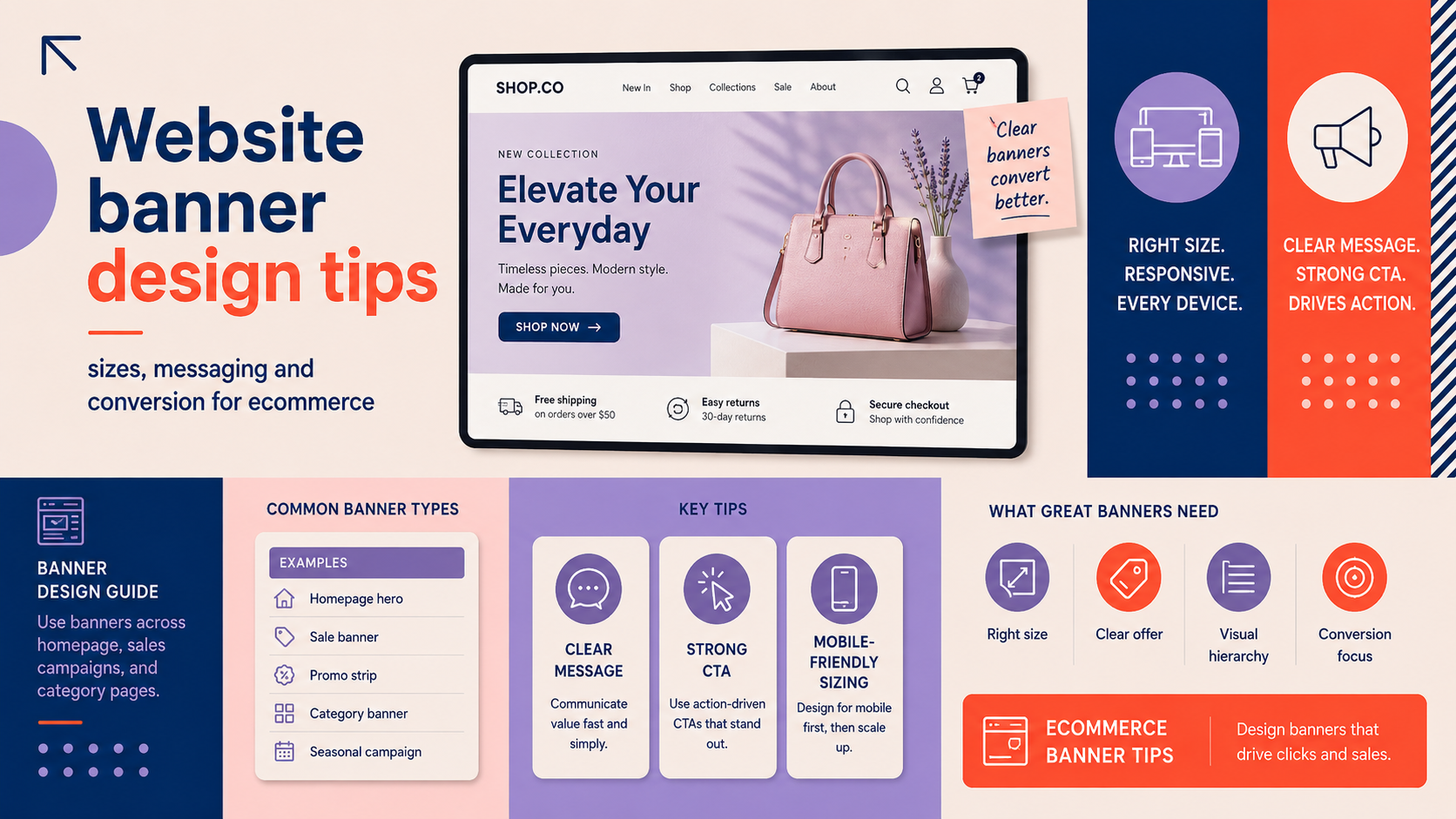
Website banner design tips matter for every ecommerce team and small business that wants to guide visitors and increase conversions. In this guide we cover what counts as a website banner (hero areas, promo strips and category banners), why they still matter, the right sizes and file specs, copy examples that convert and a practical implementation checklist you can use today.
What we mean by website banners (hero, promo, category banners)
When we say banner we mean any prominent graphic or image-based block used to present a message on your site: a full-width homepage hero, a promotional strip above content, banners on category pages or banners inside the cart. All serve the same purpose: capture attention and direct visitors to the next action.
Who this guide is for
This is written for UK small businesses, ecommerce owners and marketers who manage homepage banner design or ecommerce banner design and need practical, implementable advice.
Quick summary of what you’ll learn
- Which banner types suit different goals.
- Recommended sizes, responsive rules and file formats.
- Copy and CTA formulas that increase clicks.
- Accessibility, performance and testing steps.
Why website banners still matter for ecommerce
Banners sit at the top of many customer journeys: they introduce the brand, highlight offers and guide visitors into product pages. Used correctly they reduce friction and increase click-throughs. Used badly they confuse visitors or slow the page.
Banners vs. other homepage elements: where they fit in the funnel
Think of banners as the signpost: a clear hero or promo strip answers the visitor’s primary question quickly (what’s in it for me?) and points to product pages, categories or promotional landing pages.
Common mistakes that reduce effectiveness
- Vague messaging that doesn’t state the offer or benefit.
- Poor contrast or tiny text that’s unreadable on mobile.
- Heavy, unoptimised images that harm load speed and Core Web Vitals.
- Using carousels without clear navigation or tracking (many users ignore rotating slides).
When to use a hero banner, carousel, or promo strip
Use a single, focused hero for brand positioning or one key campaign. Use a promo strip when you need a short, persistent message (free delivery, code, notice). Carousels can work if each slide has a distinct, measurable goal, but prefer static content or manual rotation for clarity.
Website banner design tips: technical sizes and file specs
Recommended design canvas sizes
- Desktop hero: design at 1920 × 720–900px (common visible area). Allow for wider artboards but keep important content within safe zones.
- Tablet: design at 1024 × 600–700px to check scaling and line breaks.
- Mobile: design at 375 × 600–800px (portrait) and test at 360px width devices.
These values are practical starting points; responsive behaviour will determine the final crop.
Retina and high‑DPI considerations
Provide 2x assets for high‑DPI displays (for example export at 3840 × 1440 for a 1920 × 720 hero) or use vector-based elements where possible. When exporting 2x, balance file size with quality by limiting complexity.
File formats and compression
- Use WebP where supported for a balance of quality and compression.
- Use PNG for graphics with transparency or crisp logos, JPEG for complex photography where WebP is unavailable.
- Avoid unnecessarily high export quality—aim for visually lossless at reduced file size.
Responsive rules: safe zones, flexible cropping and focal points
Keep essential content (headline, CTA, product) inside a central safe zone—roughly 1200px maximum width on desktop and a vertical centre that remains visible when cropped. Use CMS focal‑point or object‑position controls so images crop predictably on different devices.
Messaging and copywriting for conversion
Headline formulas that work
- Value‑led: “Free 48‑hour delivery on UK orders over £50”
- Benefit‑first: “Comfy trainers that last—tested for 10,000 steps”
- Offer‑first (time sensitive): “Summer sale — up to 40% off, this week only”
Choose one clear idea per banner: don’t try to promote three different things at once.
Designing CTAs for clarity and urgency
Write CTAs that match the visitor intent: “Shop sale”, “View bestsellers”, “Get free sample”. Use a single primary CTA per banner and support it with microcopy if needed (e.g. “No code needed”). For promotions include a deadline when appropriate to create urgency.
How to test messaging
Run simple A/B tests comparing headline, CTA text, and image. Track CTA click-through rate (CTR), landing page conversion rate and bounce rate. Start with headline vs headline or image vs image to isolate effects.
Examples of effective ecommerce banner copy
- “New season jackets — free returns” with CTA “Shop jackets”
- “Bundle and save: 3 for 2 on skincare” with CTA “Build your bundle”
- “Next‑day dispatch — order before 2pm” with CTA “Order today”
Design principles: layout, imagery and accessibility
Visual hierarchy
Prioritise headline, then supporting text, then CTA. Use size, weight and contrast rather than colour alone. Ensure the CTA stands out using a contrasting button and space around it.
For brand consistency, keep banners aligned with your core palette and typography as defined in your brand guidelines; if you need help with this consider a full brand identity design.
Choosing imagery
Product photography works best when the goal is conversion; lifestyle photography is useful for brand storytelling. Use clean backgrounds for product banners so the item remains the focus.
Ensure any logo used in a banner has clear space and is legible; if your logo needs updating see our custom logo design service.
Colour, contrast and WCAG basics
Maintain sufficient contrast between text and background so headlines are readable at small sizes. Use bold weights and larger font sizes on mobile. Respect basic WCAG rules for contrast and avoid tiny body copy in banners.
Animation and motion
Use subtle motion to draw attention to the CTA or a product reveal. Avoid heavy or continuous animations that distract or increase CPU usage, especially on mobile.
Ecommerce banner types and use cases
Homepage hero banners
Use for brand stories, seasonal campaigns and major promotions. Keep these focused and link to a campaign landing page or curated category to measure impact.
Product promotion banners
Use banners to highlight time‑limited offers or best‑sellers. Coordinate with product packaging if launching new SKUs; consider combined banner and packaging design support for product launches.
When banners link to product pages, ensure the product page follows best practice; our article on product page design tips for small ecommerce brands: a practical UK guide explains useful follow‑up steps.
Category banners
Use these to guide discovery and highlight sub‑collections. Keep messaging simple and link directly to filtered lists or curated racks to reduce clicks to purchase.
Cross‑sell and cart banners
Small unobtrusive banners in the cart can recover value before checkout by suggesting complementary products or reminding of offers.
Performance, testing and optimisation
Optimising images for page speed
- Serve WebP where available and fall back to JPEG/PNG.
- Compress images to a sensible visual quality and use responsive srcset to serve appropriate sizes.
Lazy loading and critical image prioritisation
Lazy load images below the fold but prioritise the hero or first meaningful paint image. This helps Core Web Vitals and perceived speed.
Analytics and KPIs to track
Track banner CTR, landing page conversion rate, bounce rate and effect on average order value when banners promote bundles or discounts.
Practical A/B tests to run
- Headline A vs Headline B (measure CTR and landing conversion).
- Image A (product) vs Image B (lifestyle).
- CTA text A vs CTA B and button colour variations.
Implementation checklist and templates
Pre-launch checklist
- Name assets consistently (e.g. hero_summer2026_1920x720.webp).
- Add descriptive alt text and set link tracking (UTM tags) for campaign banners.
- Confirm focal point and responsive crop in your CMS or theme.
If you need help installing responsive banner templates on WordPress, request a WordPress web design consultation.
Responsive template: safe area and export settings
- Design at desktop 1920 × 900, keep important content inside a central 1200px wide safe area.
- Export at 1x and 2x sizes, and prepare WebP/JPEG alternatives.
Routine maintenance
Rotate promotional banners when offers end. Review performance monthly for active campaigns and quarterly for brand banners.
Quick troubleshooting
- Cropping issues: set focal point or serve different images per breakpoint.
- Slow load: check image sizes, lazy loading and CDN delivery.
- Poor contrast: adjust overlay or move headline to lighter/darker area.
For launch-specific verification see our ecommerce website launch checklist: what to test before you go live and our Website redesign asset checklist UK: agency handover guide for asset organisation tips.
When to bring in an agency
DIY is fine for simple seasonal banners. Bring in an agency when conversion remains low after tests, when banner campaigns need creative direction, or when technical integration with your CMS and tracking is required.
An agency can help with creative concepts, technical build and CRO. If you’re building or optimising a shop, consider our e-commerce store design services. Startups preparing investor materials alongside product launches may also need a pitch deck design.
Prepare an agency brief with assets, analytics access and clear goals to get faster results.
Summary and next steps
Key takeaways:
- Keep banner messaging single and clear; lead with value.
- Design responsively with safe zones and 2x assets for high‑DPI.
- Optimise images for speed and track CTR and conversion.
- Test headline, image and CTA in simple A/B tests.
Use the implementation checklist above before you publish and review performance routinely.
FAQ
What size should my homepage banner be for desktop and mobile?
Design desktop heroes around 1920 × 720–900px and mobile at 375 × 600–800px. Keep essential content inside a central safe zone to avoid unwanted cropping.
How do I write a high-converting banner headline and CTA?
Use a single focused message: state the benefit or offer, then a clear CTA such as “Shop sale” or “View bestsellers”. Test variations to find the best performing copy.
Will large banner images slow down my website and impact SEO?
Yes if they are unoptimised. Use WebP, responsive srcset, lazy loading for offscreen images and prioritise the hero image to protect Core Web Vitals.
How often should I change homepage banners for promotions or seasons?
Rotate campaign banners when the offer ends. For promotional activity review weekly during campaigns and quarterly for brand banners.
Should I use animated banners or keep them static?
Use subtle animation to draw attention but avoid continuous motion. Test performance and user behaviour; if animations cause distraction or performance issues, prefer static imagery.
Request a free consultation with Logo Metic — email [email protected] or call +44 7883 180004 to discuss banner design, site integration and CRO support.