
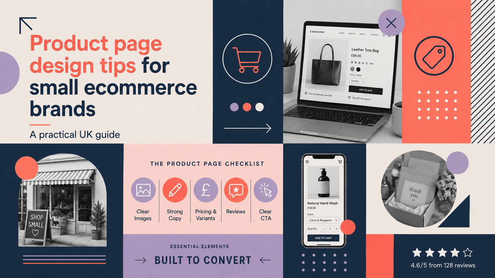
Good product page design is one of the simplest ways a small ecommerce business can increase sales and reduce returns. This guide covers practical, low-cost product page design tips ecommerce owners can apply today — from images and copy to mobile UX, trust signals and a launch-ready checklist. It is written for UK startups, independent retailers and growing brands.
Product page design tips ecommerce: What makes a high-converting product page?
Conversion-focused goals: clarity, trust and ease of purchase
A high converting product page answers three questions immediately: what is the product, why it matters to this customer, and how do I buy it without fuss. Prioritise clarity in visuals and copy, build trust with honest information and social proof, and remove friction in the checkout path.
Common mistakes small ecommerce brands make
- Poor or low-resolution images that fail to show the product in use.
- Blocks of dense copy with no scannable structure.
- Hidden delivery costs that appear late in checkout.
- Confusing variant selectors or broken add-to-basket buttons on mobile.
Quick prioritisation checklist for limited budgets
- Fix broken images and ensure the hero shot is clear.
- Write a one-line lead sentence that explains who the product is for.
- Show delivery and returns near the CTA.
- Add one or two trust signals (reviews, secure payment icon).
If you need a full store build or restructuring, our E-commerce store design services can help with end-to-end delivery and optimisation.
Product photography and visuals
Types of images to include: hero shot, gallery, lifestyle and 360°
A strong hero shot presents the product clearly on a neutral background. Supplement with close-ups for detail, lifestyle images to show scale and use, and a 360° or video if possible. These reduce uncertainty and returns.
Image quality, background and consistent styling
Keep background and lighting consistent across your range. Use the same aspect ratio and order images the same way on each product page so customers quickly find the view they want.
Optimising images for speed and SEO (alt text, file format and dimensions)
Use descriptive alt text for accessibility and SEO. Serve modern formats (WebP where supported) with fallbacks to JPEG/PNG to balance quality and speed. Resize images to the maximum display size and let the browser scale down; avoid uploading huge files.
Example: low-cost ways to stage product shots
- Use a plain sweep of white poster board for hero shots and a large window for soft natural light.
- Create simple lifestyle settings with household props to show scale.
- Smartphone cameras are capable—use a tripod and edit in free tools to crop and correct colour.
If you sell on Shopify and want platform-specific implementation for galleries or 360° imagery, see our Shopify web design expertise.
Product copy that sells (without hype)
Lead sentence: what it is and who it’s for
Start with a single sentence that names the product and the main user benefit. Example: “Lightweight commuter rucksack designed for cyclists who need fast access to a waterproof phone pocket.”
Features vs benefits: simple formula and examples
Use this formula: feature + explanation = benefit. For example, “Reflective trim (feature) improves visibility on evening rides (explanation), helping you feel safer on busy roads (benefit).” This keeps copy honest and useful.
Using bullet points, specs and scannable layouts
Use short bullet points for key benefits, then a separated technical-specs list for dimensions, materials, weight and compatibility. Shoppers scan — make it easy.
Including care, sizing and delivery information
Place sizing, care and delivery/returns information clearly on the page (or via a visible tab). UK customers expect transparent returns terms and reasonably clear delivery times before they add to basket.
Pricing, offers and trust signals
Clear pricing, discounts and transparency on additional costs
Display the full price clearly. If you show a discounted price, indicate the original price and whether stock is limited. Be explicit about VAT where applicable and potential postage costs so customers do not abandon late in checkout.
Delivery, returns and guarantee information presented near the CTA
Put short delivery and returns summaries near the CTA: for example, “Free UK delivery over £40 — 30-day returns.” A visible promise reduces hesitation.
Trust signals: secure payment icons, recognised badges and product reviews (how to use them ethically)
Show secure payment icons and any recognised badges, and include genuine product reviews. Avoid fake or misleading reviews. Strong branding also helps: a professional logo and consistent identity support trust — consider our Custom logo design for brand trust when you review visual credibility.
UX layout and on-page conversion elements
F-pattern and Z-pattern layout guidance for product pages
Place the hero image left and key info (price, short benefits, CTA) to the right on desktop so the eye naturally reads the important details. On mobile, stack the hero image above concise product info and a prominent CTA.
CTA placement, copy and variations (add to basket vs buy now)
Keep the primary CTA above the fold on mobile and desktop. Use action copy that matches intent: “Add to basket” for browsing customers, “Buy now” for immediate purchase. Test wording if you can.
Quantity selectors, variant selectors and disabled states
Make variant selectors obvious and label unavailable variants clearly. Prevent errors with sensible default quantities and clear messages for out-of-stock states.
Cross-sells and recommended products: where to place them
Suggest complementary products below the fold or in a small carousel to avoid distracting from the main conversion. Keep recommendations relevant and limited to three or four items.
Mobile-first design and performance
Responsive design rules for product pages
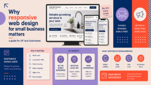
Design product pages mobile-first: large images, condensed copy blocks, and a sticky CTA that’s always reachable. We offer WordPress web design services and Responsive web design services if you need technical support to implement responsive layouts or WooCommerce optimisations.
Critical performance checks: image sizes, lazy loading and caching
Serve appropriately sized images, enable lazy loading for off-screen media, and use browser caching and a content delivery network if traffic warrants it. Fast pages have better conversion rates and lower bounce.
Mobile UX: large tappable CTAs and concise copy
Use large tappable buttons, avoid tiny links in key flows and keep mobile copy short. Test the full purchase flow on actual devices rather than only in the browser inspector.
Accessibility and legal essentials for UK stores
Simple accessibility checks (contrast, keyboard nav, alt text)
Ensure text meets contrast ratios, all images have descriptive alt text, and forms are operable by keyboard. These checks improve reach and reduce complaints.
Essential legal content: returns, terms, privacy and cookie notices
Provide clear returns, terms and privacy information. Confirm any specific obligations under UK consumer law or trade regulations with a legal advisor if unsure.
Payment security expectations and consumer rights reminders
Display secure payment indicators and be transparent about refunds and dispute processes. Remind customers of their rights where relevant but avoid legal jargon.
Testing, analytics and iterative improvements
Key metrics to track (CTR to cart, add-to-cart rate, conversion rate)
Start with these baseline metrics: product page views, click-through-to-cart rate, add-to-cart rate and product conversion rate. Track changes after any update to measure impact.
Low-cost A/B tests and user feedback tactics
Run small A/B tests on CTA wording, hero image choice or price presentation. Collect qualitative feedback via a short onsite survey or recorded user sessions with a handful of participants.
When to redesign vs iterate
If several product pages underperform and metrics suggest deeper structural problems, a redesign may be more efficient. For single-product issues, iterate with small tests first. If you are B2B or have complex product needs, our B2B web design for product-led businesses teams can advise on funnel design.
Practical checklist: a launch-ready product page
Content checklist (images, description, specs, delivery)
- Hero image + 3–5 supporting images (lifestyle, close-ups)
- One-line lead sentence + 5 bullet benefits
- Technical specs (size, weight, materials) and care
- Delivery times, costs and returns summary
Technical checklist (SEO, performance, mobile, accessibility)
- Descriptive title and meta description
- Alt text for every image and structured data where relevant
- Optimised image formats and sizes, lazy loading enabled
- Basic accessibility checks: contrast, keyboard nav
Conversion checklist (CTA, trust signals, upsells)
- Primary CTA visible and labelled to match intent
- Visible trust signals (reviews, payment icons, branding)
- Relevant cross-sells placed below the fold
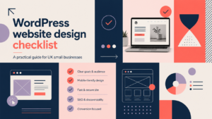
For a technical WordPress-focused checklist you can compare against, see our WordPress website design checklist for UK small businesses.
Next steps and how we can help
Quick wins to implement in a day
- Replace any placeholder or broken images with a clear hero shot.
- Add a one-line lead sentence and five bullet benefits.
- Place delivery and returns near the CTA and add one trust icon.
When to hire help: what to expect from an agency
An agency will audit analytics, propose design changes, implement images and performance fixes, and run conversion tests. If your audit uncovers larger site issues you may find our guide useful: Signs your business website needs a redesign.
Call-to-action: request a free consultation with Logo Metic
If you’d like expert help, request a free consultation with Logo Metic. Email [email protected] or call +44 7883 180004 to discuss product page improvements, ecommerce store design or a quick audit.
Frequently asked questions
How many images should I use on a product page?
Use a clear hero shot plus 3–5 supporting images: close-ups, lifestyle shots and one contextual or scale image. If possible, add video or a 360° view for higher-value items.
What information is essential to include on every UK product page?
At minimum: product name, price, main benefits, specs (size, weight, materials), delivery times/costs and returns policy. Make key points visible without forcing users to hunt.
How can I make product pages load faster without sacrificing image quality?
Serve scaled images, use modern formats like WebP with fallbacks, enable lazy loading and use caching. Compress images sensibly and avoid uploading very large originals to the site.
Should I include customer reviews on every product page?
Yes — genuine reviews build trust. Moderate reviews to remove spam or offensive content and avoid fabricating or manipulating feedback.
What quick tests can I run to see if my product page is working?
Track these metrics for a two-week window: product page views, add-to-cart rate and conversion rate. Run a simple A/B test on the hero image or CTA copy and compare add-to-cart changes.