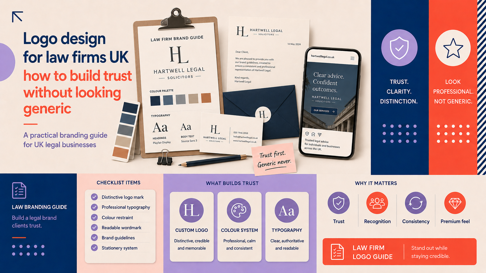
For UK law firms, a logo is often the first visual signal a potential client sees. A clear, professional mark signals competence and builds trust; a generic or poorly executed logo can undermine credibility. This guide explains how to approach logo design for law firms UK with practical steps, examples and a technical checklist so your solicitor logo design supports client confidence without looking cliché.
Why a law firm logo matters (beyond aesthetics)
Trust and credibility: how visuals influence client perception
Clients judge professionalism quickly. A considered logo sets expectations about the firm’s attention to detail and reliability. For regulated professions such as solicitors, consistency in visual identity reinforces reputation and reassures clients at every touchpoint.
Differentiation in a crowded market of solicitors and firms
The UK legal market is crowded with small and mid-sized practices. A distinctive logo makes your firm more memorable and reduces the chance you’re confused with another practice in directories, search results or local listings.
Where a logo must perform: letterheads, websites, signage, social profiles
A logo must work in many contexts: printed letterheads and business cards, your website and mobile views, social avatars and even office signage. Thinking about these early saves costly redesigns later.
Common pitfalls: why many solicitor logo designs look generic
Overused symbols: gavels, scales, pillars and laurel wreaths
Literal legal symbols are instantly recognisable but overused. They make logos blend together and can read as unimaginative, especially at small sizes.
Design shortcuts: poor typography, clip-art marks and low-contrast colour
Relying on default fonts, premade clip art or low-contrast colour combinations produces logos that feel amateur. Typography conveys tone: small changes in weight, spacing and letterform can lift a logo from generic to authoritative.
Failure to consider application (small sizes, digital, print)
Logos must remain legible at small social avatars and work in single colour for faxed documents or embossed seals. Designs that ignore scaling and reproduction issues will fail in practice.
Principles for building trust without being generic
Clarity and legibility: typography choices for solicitors
Choose type that reads clearly at a distance and at small sizes. Serif faces often convey tradition and authority; well-chosen sans-serifs can signal modernity and clarity. Pay attention to kerning and line-height—small refinements improve perceived quality.
Colour: trustworthy palettes that avoid clichés
Blue and grey are common for a reason: they communicate stability. Avoid defaulting to dark blue plus gold unless it fits your positioning. Consider deeper tonal palettes, two-colour systems or restrained accent colours to differentiate while remaining professional.
Symbolism: suggestive, not literal — tell a story without obvious icons
Abstract marks, letterforms and subtle motifs can imply counsel, stability or clarity without using literal gavels or scales. A considered symbol that references a firm’s name, location or founding principle will feel specific and meaningful. Commissioning a bespoke mark helps ensure symbolic choices are original and well executed; for firms ready to brief a designer, consider a custom logo design.
Tone and positioning: conservative vs modern firms and how to choose
Decide whether you want to project tradition (formal type, restrained palette) or modern accessibility (clean shapes, open spacing). Your tone should align with your target clients — private clients, commercial clients or niche practices each expect different visual cues.
Accessibility and contrast (WCAG basics for logos)
Ensure text in or next to your logo meets contrast standards when used on web pages and documents. Use high contrast between logo elements and backgrounds, and provide accessible alternatives where needed (for example, text-only versions for small or high-contrast contexts).
Practical process: briefing, research and concepting
Writing a clear brief: services, audience, positioning and examples
A good brief describes who you serve, the main services, competitor firms, tone of voice and three visual examples you like (and why). Be specific about required formats and where the logo must appear.
Competitor and sector research: mapping common visual tropes in UK law
Audit local and national competitors to note repeated motifs and opportunities to differentiate. Look across directories, firm websites and LinkedIn to map what works and what’s overused.
Generating concepts: ideation methods and how many to request
Ask for several distinct directions rather than multiple variations of one idea. A typical brief might request 4–6 initial concepts so you can compare different approaches—wordmarks, monograms, abstract marks and combination marks. If you prefer bespoke work, a custom logo design process will prioritise original concepts specific to your brief.
Testing concepts: client feedback, in-house review and simple A/B checks
Test concepts at real sizes: email signatures, social avatars and letterheads. Gather feedback from colleagues and a small sample of clients, focusing on readability and perceived tone rather than personal taste alone.
Design checklist and deliverables for solicitor logo design
File formats and colour specs: SVG, EPS, PNG, CMYK and RGB guidance
- Request vector master files: SVG and EPS for scalability and print.
- Provide PNG exports with transparent background for digital use.
- Ask for CMYK and RGB/Hex colour values so printers and screens reproduce colours consistently.
- Include a PDF guide showing correct colour swatches and usage notes.
Responsive lockups and minimum sizes
Request simplified or stacked versions of your logo for narrow spaces and a defined minimum size for legibility. Provide a clear-fix (single-colour) version for faxes, stamps or embossing.
Brand usage rules: spacing, do’s and don’ts
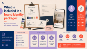
Agree a short set of rules: minimum clear space, incorrect uses to avoid, acceptable colour reversals and typography pairings. For larger projects consider a full guideline; you can discuss a complete brand identity if you need full usage documentation.
Stationery, email signatures and social avatar specs
- Provide business card and letterhead mockups.
- Give pixel dimensions and safe margins for social avatars.
- Include an email signature template with suggested font sizes and spacing.
Examples and alternatives to clichéd law firm imagery
Wordmark and typographic treatments: when type alone builds authority
Strong typographic wordmarks rely on careful letter spacing and unique treatments (for example, a customised letter or ligature) to feel distinct without an additional symbol.
Abstract marks that imply stability, clarity or counsel
Shapes such as interlocking forms, shields pared back to simple geometry, or balanced horizontal marks can imply partnership and stability while remaining distinctive.
Using monograms and letterforms with meaning
Monograms can be effective for small practices or named partners. Combine initials with subtle references to the firm’s locality or practice area to add meaning.
Combining subtle illustrations with professional typography
Small, restrained illustrations—an abstract mapline, a horizon line or bespoke pattern—paired with confident typography often feel more considered than literal legal symbols.
Applying your logo across touchpoints: website, print and social
Website: placement, responsive behaviour and favicons
Place your primary logo in the site header and use a simplified mark for mobile and favicons. Ensure the logo remains crisp on high-DPI displays. If you plan a site update, get web specialists involved early; Logo Metic offers WordPress web design services to help implement logos correctly online.
Print: letterheads, business cards and office signage
For print, request CMYK values and print-ready PDFs. Confirm safe margins for letterheads and ensure business cards include a clear version of the logo that reads at small sizes.
Social and previews: profile images and Open Graph considerations
Design a strong square avatar and test how your logo appears when cropped. Provide a clear, contrasting banner image for social headers and ensure Open Graph images display a recognisable logo. If you sell printed or digital products through your site, discuss how logos appear on product pages when working with web designers; consider an e-commerce store design consultation where relevant.
Working with web and design suppliers to ensure correct implementation
Share master files and the usage guide with suppliers. If you need assistance, request a WordPress website consultation to confirm responsive behaviour, image optimisation and accessibility.
How to choose between a custom logo and a logo maker
When a custom logo makes commercial sense for a firm
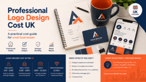
Custom logos pay back when distinctiveness and reputation matter — for example, when you target higher-value clients or operate in a competitive local market. See our practical cost guidance to inform budgeting decisions: professional logo design cost UK.
Risks of inexpensive templates for professional services
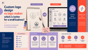
Template or maker logos can be quick and cheap but risk duplication and a lack of originality. For a deeper comparison see custom logo design vs logo maker.
Questions to ask a designer or agency before you hire
- Can you show examples of work for professional services?
- What file types and usage guidelines are included?
- How many initial concepts and rounds of revisions are provided?
Final checklist and next steps for UK law firms
Quick 10-point launch checklist
- Confirm primary and secondary logo lockups.
- Obtain SVG/EPS masters and PNG exports.
- Record RGB/Hex and CMYK colour values.
- Define minimum sizes and clear space.
- Create single-colour and reversed versions.
- Prepare business card and letterhead files.
- Design social avatar and Open Graph image.
- Test on mobile, desktop and print proofs.
- Share usage rules with staff and suppliers.
- Plan a phased rollout to clients and on marketing materials.
Preparing a brief to share with designers
Include firm overview, target clients, competitor examples, desired tone and required deliverables. When you’re ready to request bespoke work, request a custom logo consultation to discuss options and next steps.
When to consider a full brand identity project
If you need consistent messaging, tone of voice, templates and full usage rules alongside a logo, consider a complete identity project. To explore this, discuss a complete brand identity with our team.
Frequently asked questions
What makes a good solicitor logo design for a UK law firm?
A good solicitor logo is legible, appropriate to your positioning, original and reproducible across sizes and media. It should support credibility and be consistent with your wider communications.
Should a small law firm use a logo maker or hire a designer?
Logo makers can be suitable for very low-budget needs, but if you want distinctiveness and trustworthiness, commissioning a designer usually delivers better long-term value and fewer duplication risks.
How can we make our law firm logo look professional without using clichéd legal symbols?
Focus on typography, subtle symbolism related to your name or location, abstract marks that imply stability, and a considered colour palette. Small customisations to type or letterforms can create distinctiveness without literal imagery.
What file formats and sizes should a law firm ask for when getting a new logo?
Ask for vector files (SVG, EPS), PNGs with transparent backgrounds, print-ready PDFs, and colour specifications in RGB/Hex and CMYK. Also request simplified versions for small or digital-only use.
Will changing our logo damage client trust and how should we manage a rebrand?
Rebrands can strengthen trust if managed carefully. Communicate reasons for the update, roll out changes gradually, and keep key identity elements consistent where appropriate to avoid confusing clients. For regulated claims about services, check guidance from the Solicitors Regulation Authority and seek appropriate professional advice.
Request a free consultation with Logo Metic — if your firm needs help briefing a designer or developing a distinctive solicitor logo design, our team can advise on concepts, deliverables and implementation. Email [email protected] or call +44 7883 180004 to start.